February 2019
|
February 2019 // Volume 57 // Number 1 // Feature // v57-1a3


Method for Monitoring Quality of Extension Programs: A Dashboard Construction Process
Abstract
We describe a process for construction and use of a "dashboard" for monitoring the quality of in-person nonformal education programs. We followed the process to develop a 4-H special interest (SPIN) club dashboard, but the steps are applicable to any education program that includes instruction over multiple sessions. The dashboard construction process comprises selecting performance measures, choosing data collection strategies, designing the content and layout of the dashboard, collecting data, and populating the dashboard with performance metrics. Although these process steps are intuitive, specific decision options within each step can be complex. Our article includes discussion of these complexities in the context of our SPIN club application.
Providing top-quality nonformal education experiences that create positive change is the essence of Cooperative Extension. Extension professionals use an array of nonformal education formats to accomplish this mission. Among these are online trainings, print publications, educational websites, individual consultations, blogs, web-based videos, demonstration programs, and in-person education. Quality, which may be defined as the customer's perception of excellence (Peters, 1987), is of central importance to all these formats. Use of effective formats in educational programs engages constituents, provides them with valued learning experiences, and yields positive change. Poor quality programs, in contrast, are missed opportunities for positive change, and are correlates of attrition (e.g., Ellis, Taggart, Martz, Lepley, & Jamal, 2016). People in need of knowledge can easily look to other programs and services. The electronic age places myriad competitors readily at the fingertips of any citizen seeking knowledge. Quality thereby becomes a primary basis for success among competing providers. Quality nonformal education is thus pivotal to the mission of Extension and to its success in the increasingly competitive information and training industries.
Monitoring the quality of constituents' educational experiences is essential to success. "Only when quality is quantified," Lean Six Sigma authorities Pyzdek and Keller (2003) have explained, "can meaningful discussion about improvement begin" (p. 278). Herein we describe a process that can be used to monitor the quality of in-person education programs conducted over a series of sessions. The process yields a performance dashboard. A performance dashboard (e.g., Pyzdek & Keller, 2003; Spitzer, 2007) is a succinct summary of the status of high-level key performance indicators (KPIs). A dashboard provides a powerful and convenient answer to the question "How efficient and effective is our service at this moment?" A complete dashboard for program quality assessment includes four sets of performance indicators addressing (a) performance in serving stakeholders, (b) performance in efficiency and effectiveness of internal processes and operations, (c) financial performance, and (d) performance in continuing professional development. In this article, we describe our use of the dashboard construction process to develop and implement a performance dashboard for a 4-H special interest (SPIN) club. The process we describe is fully applicable to development of similar dashboards for education programs for adults or other youth programming.
Performance Dashboard Development and Use
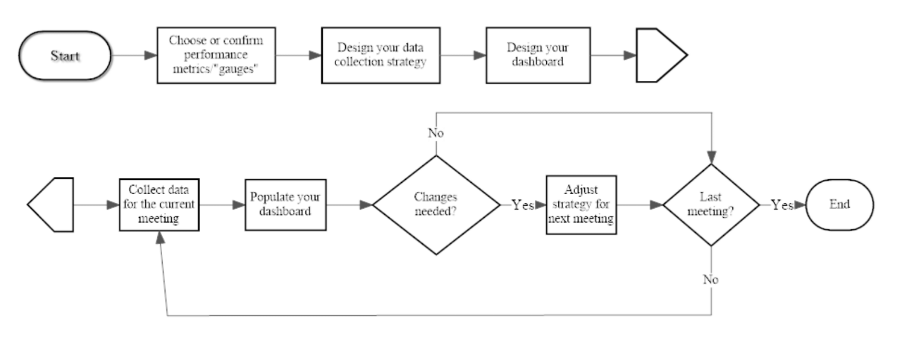
Figure 1 illustrates the major steps of our performance dashboard development and implementation process. In the diagram, process steps are shown in rectangles, and decision points are indicated by diamonds. The major process steps are as follows: (a) choose performance metrics, (b) design the data collection strategy, (c) design the dashboard layout, (d) collect data, (e) populate the dashboard, and (f) adjust the education formats as needed, using quality improvement actions. Descriptions of these process steps follow the figure.
Figure 1.
Dashboard Process Model for Monitoring 4-H Club Meeting Quality
Step 1: Choose Performance Metrics
A performance dashboard for a nonformal education program should report the "critical few" KPIs necessary for monitoring whether quality education is occurring. Our goal with our 4-H SPIN club application was to create a system that would be minimally intrusive to the experience of attendees but still provide reliable scores for monitoring performance. To meet this goal, we chose two KPIs: situational engagement during each club meeting and perceived value of each club meeting (Ellis et al., 2016). Committed to the goal of being minimally intrusive, we devised a small number of questionnaire items that we could use to obtain data related to the KPIs (see Figure 2). In addition to the two KPIs, we also chose to include one "process" indicator as a performance metric: attendance rate per meeting.
|
In-Person Education Sessions
Situational Engagement Definition: The extent to which participant reports active motivational involvement in a structured experienceItems
Perceived Value Definition: The individual's degree of contentment with his or her decision to participate in the structured experienceItems
|
We organized our engagement and perceived value metrics into "meeting type" categories (Ellis et al., 2016). If both engagement and perceived value averages were above a performance standard we had identified, the meeting was classified as a "positive youth development" meeting. If both were below the performance standard, the meeting was classified as "in need of improvement." If engagement was high but perceived value was low, the meeting was classified as a "hedonic" meeting. If engagement was low but perceived value was high, we classified the meeting as an "instrumental" meeting. Determining performance standards requires a judgment call. The cutoffs should be the lowest engagement and perceived value averages (means) that are acceptable to the program manager, given his or her goals and resources.
Step 2: Design the Data Collection Strategy
A number of approaches to data collection are possible. Paper-and-pencil questionnaires can be administered, and this practice continues to be used relatively often. Paper-and-pencil methods, though, are labor intensive. One must produce questionnaire copies, provide pencils, and enter data into a spreadsheet or statistics application for analysis. For these and other reasons, electronic questionnaires have become popular. Electronic methods involve no production costs once established, nor do they require mechanical writing instruments. Moreover, with many electronic applications, automated statistical analysis eliminates the need for the researcher to download data into spreadsheets for analysis. A number of electronic survey applications are available. Among the popular options are Qualtrics (www.qualtrics.com) and Survey Monkey (www.surveymonkey.com).
Our SPIN club application required both paper-and-pencil and electronic questionnaires. The paper-and-pencil versions were necessary at sites without Internet connections. Additionally, we noted that some of the clubs included substantial numbers of members who did not have cellular phones or other applicable devices.
Step 3: Design the Dashboard Layout
A dashboard is simply a visual display of KPIs. A well-developed dashboard is populated with a small number of charts, graphs, and/or tables summarizing the selected KPIs. A comparison to an automobile dashboard is helpful for understanding effective performance dashboard design. When we drive our vehicles, the performance variables we potentially could measure to assess the comfort, navigation, operation, and safety systems defy counting. They easily number in the hundreds. Yet when seated at the steering wheel, a driver encounters an array of a few critical performance metrics strategically and conveniently posted on the dashboard, in or near his or her immediate field of vision. Gauges and devices tell about the vehicle's speed, revolutions per minute of the engine, the engine temperature, the gear setting of the transmission, the temperature of the passenger compartment, the status of the fuel reserves, the air pressure in the tires, the volume at which the audio system is projecting, and the direction the driver is going. Although the driver does not have all measures needed to diagnose the causes of system failures (mechanics have those gauges), he or she, as manager of the automobile, has sufficient high-level gauges to safely and comfortably operate the vehicle. Likewise, a 4-H club performance dashboard shows only the critical few KPIs the program manager needs to make decisions.
Designing a dashboard layout involves choosing which tables, figures, or graphs will display the data in a way that is easily monitored. For example, on a car dashboard, the revolutions per minute gauge is often found next to the miles per hour gauge. Similarly, program managers need to decide the style, number, and location of each component of a program performance dashboard. A common error program managers make in designing performance dashboards is including too many metrics. Too many metrics distract a program manager from readily understanding the central story told by the data. Excessive complexity impedes decision making and stifles quality improvement. Indeed, Spitzer (2007) noted that "measuring too much can be as dysfunctional as measuring too little" and underscored this assertion with an anecdote of a manager commenting, with obvious exasperation, "We measure everything that moves, but little that matters!" (p. 34).
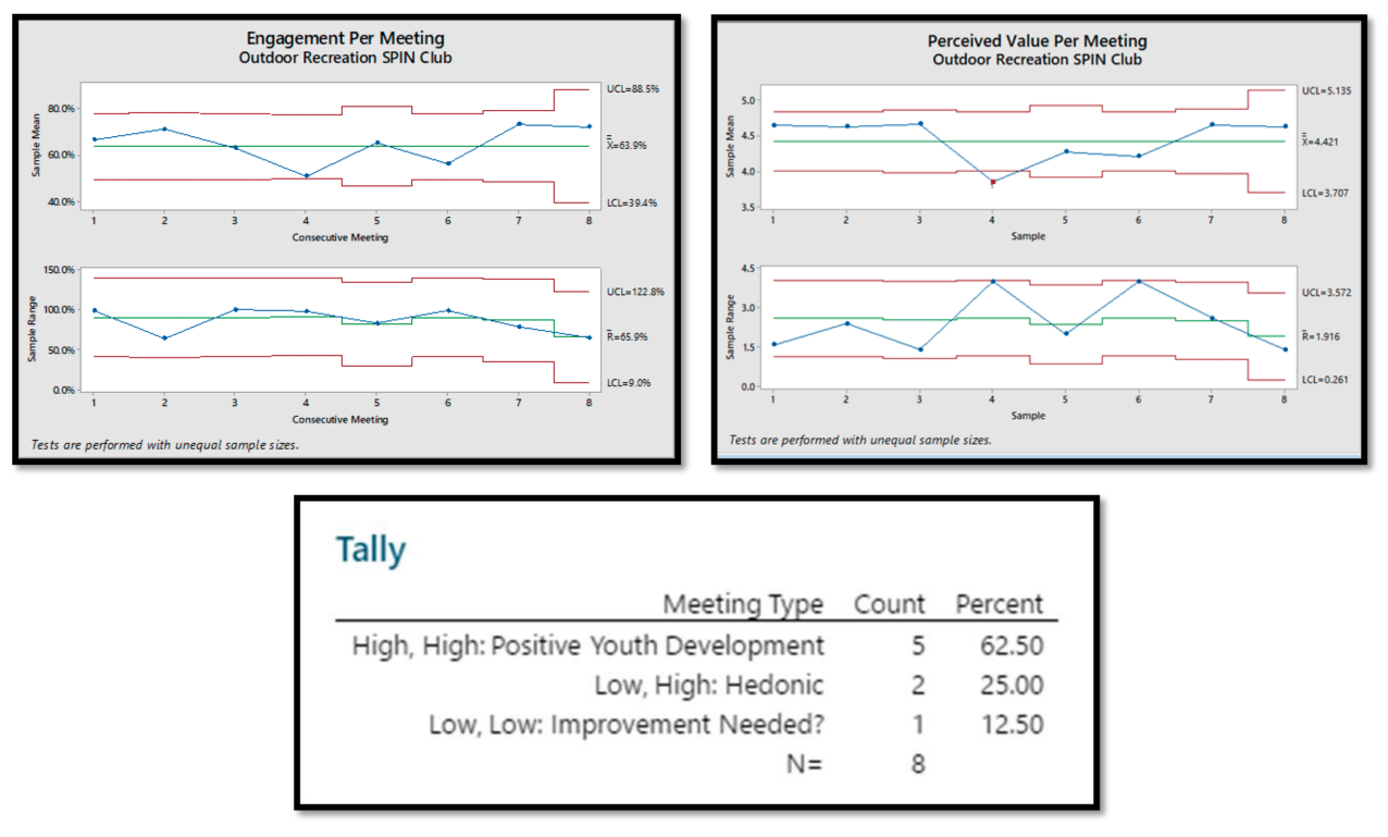
By contrast, when effectively implemented, a performance dashboard allows a program manager to focus attention on the "critical few" metrics that do matter while avoiding tedious and wasteful measurement of the "trivial many" variables that do not matter. Figures 3 and 4 are different versions of the dashboard for our SPIN club; they show two different approaches to displays of the same data. Both are fully appropriate, but Figure 4 provides additional information that may be useful. Figure 3 contains visual displays of data that are familiar to most people: two interval plots, one bar chart, and a table. The interval plots show the average score for each meeting and the confidence intervals around those means. The plots in Figure 4 are statistical process control charts. They provide a more precise measure of variability. Separate statistical process control charts are shown for the average scores and for measures of the degree of scatter in those scores (range of scores). An effective meeting should result in high scores (high means) with minimal variation (small ranges). Statistical process control also reveals highly unlikely data points. For example, in Figure 4, the mean of the perceived value scores for SPIN Club Meeting 4 lies outside the red lines, indicating that that mean is a statistically significant departure from the pattern of means. Additionally, the range for that meeting is large compared to the ranges for most of the other meetings. The dashboard display suggests, then, that the content, method, and instructional context of SPIN Club Meeting 4 should be targets for improvement when the topic of that session is taught on a future occasion.
Figure 3.
4-H Special Interest Club Dashboard at Program Completion: Interval Charts
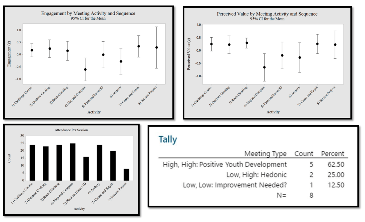
Figure 4.
4-H Special Interest Club Dashboard at Program Completion: Statistical Process Control Charts (X bar, R)
Step 4: Collect Data
For reasons of ecological validity (e.g., Csikszentmihalyi & Larson, 2014), we recommend that data be collected immediately following conclusion of a meeting. We used this approach for our dashboard development project. This method prevents judgments from being affected by cognitive reframing, opinions of other participants, or myriad other factors that can affect the short-term memory, mood, and emotions of evaluators. At least two options can be considered for collection of these end-of-meeting data: the "everyone present" approach and the "evaluation team" approach.
For the "everyone present" approach, all meeting participants who were present are asked to complete questions measuring the performance outcomes. The cost of securing information from everyone, though, can be substantial. A given 4-H club meeting may include well over 100 participants. Collecting, analyzing, and interpreting data from such a large group can be a major undertaking.
An alternative is to use an "evaluation team" approach. A small team of evaluators can be assigned to rate the KPIs immediately following each meeting. At the end of each meeting, the team would meet to review their observations and impressions. They would work toward a rating representing consensus among the evaluation team members. This method parallels the participant–observer approach to qualitative research (e.g., Labaree, 2002) and the mystery shopper strategy (e.g., Berry, 1995) from marketing. Substantial gains in efficiency of data collection and processing are evident. Disadvantages of this approach would be the need for some degree of training of the evaluation team, the risk of influential team members' aggressively asserting their opinions, the assumption that the team can adequately represent the KPIs for the entire group, and the loss of opportunity to conduct in-depth analyses beyond the analyses needed to complete the dashboard. Additionally, if the evaluation team approach is used, minor wording revisions to questionnaire items may be needed. For example, items beginning with "I felt," "I wish," and "I am" could be changed to begin with wording such as "Overall, participants seemed to feel," "Most participants seemed to," or so on.
Step 5: Populate the Dashboard
Once data have been collected, it is time to populate the dashboard. Paper-and-pencil data must be entered into a dashboard by hand. Although this is a tedious process, it is crucially important and requires confirmation of accuracy and precision. As with any evaluative process, the results are worth only as much as the data underlying them. Mistakes made during data entry yield skewed results and erroneous findings. Alternatively, a program manager who is able to collect data using an online platform (e.g., Qualtrics or Survey Monkey) will be assured that the data analyzed are indeed the data the program participants reported.
We recommend using a spreadsheet program, such as Microsoft Excel, or a statistical application, such as Minitab, for data entry, storage, and analysis. Most program managers are familiar with Excel but might not be as familiar with Minitab. Minitab may be thought of as a more advanced version of Excel. It similarly includes spreadsheets to store data and can be used for producing a variety of excellent data visualizations (e.g., bar chart, histogram, Pareto chart). A program manager also can use Minitab to conduct a number of basic and advanced statistical analyses, ranging from determining averages and ranges of scores to performing complex multivariate analyses. More accomplished software users may choose to explore advanced applications for dashboard development. An electronic search will readily generate numerous options.
Alternatively, an application such as Qualtrics automatically analyzes data and produces user-friendly reports. Such a feature may be particularly valuable to managers who face limits on the time and financial resources needed to create data displays through spreadsheet applications or statistical software.
For the most part, we used Qualtrics to collect data, and we used Minitab to create visual displays of the data. We could have used data display functions provided by Qualtrics, but we preferred a more elaborate presentation of the data.
Step 6: Implement Quality Improvement Actions
A performance dashboard tells a program manager that there is a problem, but it does not tell exactly how to solve it. A common scenario from cold and flu season serves to illustrate this point. Someone beginning to feel ill may stick a thermometer under her tongue to measure her body temperature. If the thermometer reading exceeds the 98.6-degree standard for optimal performance of the human body, she may take further action to diagnose the cause. For example, if the thermometer shows a reading only slightly above the standard, she may wait a while and then retake her temperature. If the reading is higher or is accompanied by other symptoms, she may make an appointment to see a physician. A performance dashboard is like the thermometer. It reveals whether a program manager is "on track" with regard to the desired level of program quality or needs to change strategies. As is the case with someone checking his or her temperature, though, the dashboard does not diagnose the problem. Diagnosis is beyond the scope and purpose of the dashboard.
Although determinations of what actions to take to improve a program are specific to the program itself, a brief discussion herein of possible quality improvement actions is appropriate. Leaders of the quality management movement probably would advise a program manager to investigate the cause of scores that are out of acceptable range. Specifically, they would advise the manager to listen to the voice of the customer. In other words, an Extension program manager might elicit recommendations from participants for ways to improve the quality of the education sessions. Of course, there are many approaches to obtaining such input. One option, for example, is the "start, stop, continue" exercise. This technique is simple and powerful and can be accomplished by devoting a few minutes of a session to asking participants these questions:
- What do we need to start doing during the sessions?
- What do we need to stop doing during the sessions?
- What do we need to continue doing during the sessions?
Listening carefully to the voice of the customer by using this technique can be a powerful first step toward increasing program quality.
Discussion
The process described herein can be used to monitor the quality of in-person education programs conducted over a series of sessions. The process yields a performance dashboard, or summary of KPIs. These KPIs are crucial to measuring, monitoring, and managing programs. Performance dashboards are well established in many industries and have potential for wide use in Extension as well. Dashboards may provide significant insight into the key facets of Extension programs.
A number of challenges accompany the development and use of performance dashboards. If you are interested in using performance dashboards to monitor program quality, consider the following recommendations:
- Focus only on the critical KPIs and actively avoid including measures of nonvital outputs. It is easy for measures of quality to become cluttered with less than useful information. Just because you can measure something does not mean you should measure it.
- Be alert to the fact that some people may be threatened by the development of new programs that involve continuous measurement and monitoring of performance. Simply explaining that a performance dashboard is used for monitoring, learning, and improving, and not for the purpose of making career-based judgment calls, can help address this situation. When staff see a performance dashboard as a way to improve programs, real changes can take place (Herman & Grant, 2015).
- Involve other program staff in the creation and execution of performance dashboards. Such involvement facilitates input and buy-in and is likely to result in a sense of ownership and pride of accomplishment.
- Understand that developing dashboards and weaving them into the fabric of programs requires additional human resources. When data are collected electronically, as in the example on which this article is based, expertise is required for creating electronic questionnaires, making those questionnaires readily accessible to program participants, converting responses into visual displays of data, and sharing those responses with leaders responsible for the quality of programs. Program managers must also commit time to interpreting the data and making appropriate program improvements.
In our work with dashboards, we have consistently found investment in resources to be essential to quality. Employees who initially feel threatened by implementation of a new performance dashboard system quickly become active supporters. They develop enormous pride in high scores they earn on performance metrics. Those high scores, of course, reflect quality performance by the organization. Quality management authorities have argued that investment in performance measurement is essential to quality. H. James Harrington, an expert in business process improvement and quality management, may have put it best. He explained (as quoted in Spitzer, 2007, p. 19), "If you can't measure something, you can't understand it. If you can't understand it, you can't control it. If you can't control it, you can't improve it."
Author Note
Andrew Lacanienta is now an assistant professor at California Polytechnic State University in San Luis Obispo, California.
References
Berry, L. L. (1995). On great service: A framework for action. New York, NY: Simon & Schuster Free Press.
Csikszentmihalyi, M., & Larson, R. (2014). Validity and reliability of the experience-sampling method. In Flow and the foundations of positive psychology (pp. 35–54). Netherlands: Springer.
Ellis, G. D., Taggart, A. S., Martz, J., Lepley, T., & Jamal, T. (2016). Monitoring structured experiences during youth programs: Development of brief measures of perceived value and engagement. Journal of Youth Development, 11(3), 159–174. https://doi.org/10.5195/jyd.2016.469
Herman, M., & Grant, S. (2015). Minnesota 4-H youth program quality improvement model. Journal of Extension, 53(4), Article 4IAW4. Available at: https://www.joe.org/joe/2015august/iw4.php
Labaree, R. V. (2002). The risk of "going observationalist": Negotiating the hidden dilemmas of being an insider participant observer. Qualitative Research, 2(1), 97–122.
Peters, T. J. (1987). Thriving on chaos: Handbook for a management revolution. San Francisco, CA: Harper & Row.
Pyzdek, T., & Keller, P. A. (2003). Quality engineering handbook. Boca Raton, FL: CRC Press.
Spitzer, D. R. (2007). Transforming performance measurement: Rethinking the way we measure and drive organizational success. New York, NY: American Management Association.