April 2019
|
April 2019 // Volume 57 // Number 2 // Tools of the Trade // v57-2tt3


(Mis)Communicating with Geographic Information System Mapping: Part 1—Choosing Unit of Representation
Abstract
Extension professionals are increasingly using geographic information system (GIS) technology to develop and inform programs and services. In this article, we use a mapping exercise to demonstrate how the unit of data can be applied and inadvertently misrepresented in GIS mapping. We contrast the use of counts, percentages, and location quotients with the same data and the resulting divergence in maps. The discussion addresses ideal circumstances for using each unit of data. Overall, the article illustrates the need for Extension professionals to be cognizant of the benefits and limitations of various units of data to avoid miscommunication when using GIS mapping.
A geographic information system (GIS) is a system involving the gathering, management, analysis, and display of data associated with spatial locations (U.S. Geological Survey, n.d.). GIS is a powerful tool and is particularly helpful in communicating complex information to nontechnical audiences. Thus, the utility of GIS in informing programming is increasingly being recognized within Extension. In the last three decades, over 200 articles published in the Journal of Extension define and explain GIS (e.g., Watermolen, Andrews, & Wade, 2009) and provide examples of its use (e.g., Estwick, Griffin, James, & Roberson, 2016; Göçmen, 2013). GIS enables us to summarize facets of an existing situation; show changes over time; reveal interrelationships, differences, and similarities among places; and project future patterns of data—making it essential in supporting program planning and decision making (Esri, 2012). Nonetheless, GIS mapping also can be used, even if inadvertently, to mislead or misrepresent data. In this article, Part 1 of a two-article set, we discuss an important element of mapping that should be considered to represent information more accurately—namely, the unit of data representation.
Unit of Representation
Statisticians caution scholars about choosing appropriate measures to represent data. For example, in basic descriptive statistics, we understand benefits and limitations of three measures of central tendency—the mean (i.e., average), median (i.e., 50th percentile of data), and mode (i.e., data point with highest frequency). The median is least subject to data fluctuations, skewness, and outliers, whereas the mean is an appropriate measure if data are continuous and normally distributed. Similarly, no single unit of representation is always appropriate in GIS mapping.
One Data Set: Three Maps
To illustrate the importance of choosing the appropriate unit of representation, we used county-level data on the number of ethnic minorities in Nebraska from the 2010–2014 U.S. Census (U.S. Census Bureau, 2014). We mapped these data three ways. Figure 1 shows the geographic spread of racial and ethnic minorities using counts (i.e., numerical frequency). Figure 2 shows the proportions of counties' populations that are racial and ethnic minorities. Figure 3 illustrates the use of a unit of representation that constitutes the ratio between the share of ethnic minorities in a county in contrast to the share of ethnic minorities statewide. Each map paints a different picture.
Figure 1 is a map of the number of ethnic minorities per county in Nebraska. An examination of the map implies two "hot spots," suggesting high minority populations in eastern counties A (Lancaster) and B (Douglas). The figure does not highlight minority presence anywhere else in the state.
Figure 1.
Minority Population Counts/Frequencies by County
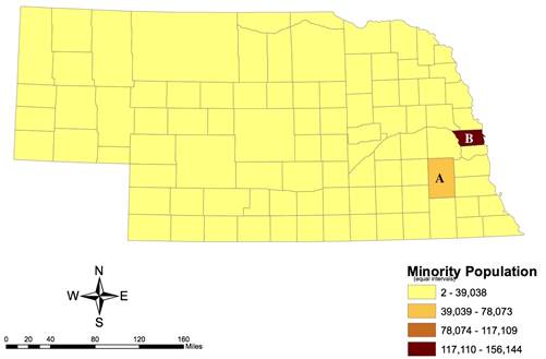
Figure 2 is based on the same data but addresses the percentage of ethnic minorities in each county. Figure 2 shows greater dispersion of "hot spots." The count map (Figure 1) shows where in the state most of the minority population resides—information that is important if one wants to reach the greatest number of minorities. The percentage map (Figure 2) shows the counties where minorities have a considerable presence relative to the county population—important information if one's aim is to address minority-related issues in a county, given that a higher percentage of minorities may mean that the presence of minorities is more salient.
Figure 2.
Minority Population Percentages by County
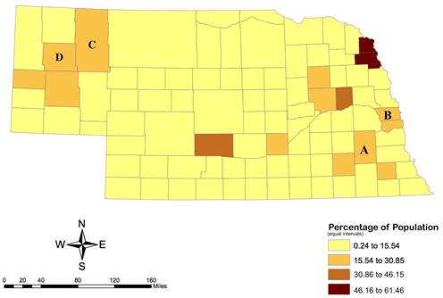
The limitation of using counts/frequencies (Figure 1) is particularly illustrated by our case. The two counties highlighted (A and B) account for more than 40% of the entire state population because the two most populous cities in Nebraska (Lincoln and Omaha) are located in these counties. Thus, virtually any count, no matter what is being measured (e.g., number of people in poverty, number of people with high incomes), will be high in those two counties. Using percentages (Figure 2) ameliorates this problem to some degree because the identified percentage range for a county represents the relative proportion of minorities. However, because many Nebraska counties have small population sizes, some counties might appear to have high rates even if only small numbers of minorities live in those locales. For example, counties C (Sheridan) and D (Box Butte) in Figure 2 show mid-range percentages of minorities, but their populations include only approximately 900 and 1,900 ethnic minorities, respectively. Several other counties have higher numbers of minorities but also larger county populations and thus are not emphasized in this map.
Another unit of representation is the location quotient (LQ), which compensates for the weaknesses of counts and percentages. LQs are ratios that show the concentration of a particular group in a subarea (e.g., county) relative to the concentration in a larger geographic area (e.g., state). LQs contextualize data. Figure 3 illustrates the rates of racial and ethnic minorities in each county relative to the rate for the state as a whole (i.e., LQ). For example, county B (Douglas) has an LQ of 1.51, calculated as follows: Percentage of population of minorities in county B (29.0%) divided by percentage of population of minorities in Nebraska (19.2%). An LQ above 1 indicates that a county has a high concentration of racial and ethnic minorities as compared to the state average percentage. Figure 3 shows that there are eight counties that have concentrations of ethnic minorities higher than that of the state.
Figure 3.
Minority Population Location Quotients by County
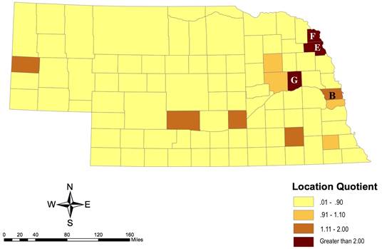
In many ways, LQs identify unique patterns in the data. For example, Brantingham and Brantingham (1997) used LQs to identify crime hot spots, taking into account the rate of criminality in broader regions. Kramer (2018) noted the potential for LQs to detect unusually high racial segregation patterns in neighborhoods. In our case, Figure 3 reveals that counties E, F, and G have ethnic minority concentrations that are twice as high (LQ > 2) as the state average. Indeed, county E is the location of a reservation for the Omaha and the Winnebago tribes, and counties F and G have large meatpacking facilities employing many Hispanic/Latino workers and migrant workers from Africa.
Conclusion
The choice of unit of data representation depends on numerous factors, most important of which is the intention of the mapping exercise. To best communicate the intended message, it is important that we make the choice of data representation intentionally while taking limitations of each type into consideration. By being cognizant of the benefits and downsides of each type of unit of representation, Extension professionals using GIS mapping can maximize the power of mapping for analyzing and communicating information and avoid miscommunication. A second aspect of this topic, how different categorizations of data provide different stories, is presented in Part 2 of this article set, also in this issue of the Journal of Extension (see https://joe.org/joe/2019april/tt4.php).
Acknowledgment
Our study was funded by a Research and Engagement Grant from the Rural Futures Institute at the University of Nebraska.
References
Brantingham, P. L., & Brantingham, P. J. (1997). Mapping crime for analytic purposes: Location quotients, counts, and rates. In D. Weisburd & T. McEwen (Eds.), Crime mapping and crime prevention (pp. 263–288). Monsey, NY: Criminal Justice Press.
ESRI. (2012). Thinking about story maps, ArcNews, Summer, 1–4. Retrieved from www.esri.com/new/arcnews/summer12articles/thinking-about-story-maps.html
Estwick, N. M., Griffin, R. W., James, A. A., & Roberson, S. G. (2016). Enhancing Extension and research activities through the use of web GIS. Journal of Extension, 54(5), Article 5IAW3. Available at: https://joe.org/joe/2016october/iw3.php
Göçmen, Z. A. (2013). GIS in public planning agencies: Extension opportunities. Journal of Extension, 51(4), Article 4FEA5. Available at: https://www.joe.org/joe/2013august/a5.php
Kramer, M. R. (2018). Residential segregation and health. In D. T. Duncan & I. Kawachi (Eds.), Neighborhoods and health (pp. 321–356). New York, NY: Oxford.
U.S. Census Bureau. (2014). 2010–2014 American Community Survey 5-year estimates. Retrieved from https://factfinder.census.gov/faces/tableservices/jsf/pages/productview.xhtml?src=CF
U.S. Geological Survey. (n.d.). What is a geographic information system (GIS)? Retrieved from https://www.usgs.gov/faqs/what-a-geographic-information-system-gis
Watermolen, D. J., Andrews, E., & Wade, S. (2009). Extension educators can use Internet GIS and related technologies. Journal of Extension, 47(5), Article 5FEA2. Available at: https://www.joe.org/joe/2009october/a2.php