October 2016
|
October 2016 // Volume 54 // Number 5 // Tools of the Trade // v54-5tt3


Developing Interactive Website Charts for Extension Clientele by Using Google Docs
Abstract
Interactive website charts can be used to engage stakeholders and help them understand and apply relevant data. We explain methods we used to create and implement interactive charts for online outreach so that other Extension personnel can use similar interactive tools with their clientele. We describe step by step and in detail how we made interactive graphs and embedded them in a website. We also explain why we chose to use Google Docs as the source for this effort. Our approach offers a useful way to disseminate beneficial information to Extension clients.
Introduction
In the world of information dissemination, the use of interactive charts is becoming more widespread. In our efforts to engage clientele and provide valuable data, we have made research-based information available to Extension stakeholders via dynamic online charts. A main concern with switching to interactive e-learning in Extension has been that some people are unsure of how to use it (Williamson & Smoak, 2005). Our objective here is to provide sufficient insights and details so that others in Extension can apply our methods to their areas of expertise and, thereby, supply their stakeholders with similar interactive tools. Specifically, we discuss Google Docs as an example of an application that can be used to create interactive graphs for online outreach. We chose to use Google Docs in our work due to ease of use for sharing and collaboration.
Background
In addition to generating timely, research-based information, Extension professionals make use of various types of technology to deliver that information to their clientele. Often the delivery itself must be engaging and at times even entertaining. Interactive online charts, such as those hosted on the Kansas State University AgManager.info website, are tools that can be used to engage stakeholders and help them understand and apply relevant data. The example we describe here involves presenting data associated with days suitable for fieldwork (DSFW). The DSFW data were collected from historical and weekly U.S. Department of Agriculture (USDA) National Agricultural Statistics Service crop progress reports (U.S. Department of Agriculture, National Agricultural Statistics Service, 2015). The data were analyzed such that results were suitable to be presented graphically. In Kansas, DSFW are reported for each USDA crop reporting district and are available from 1980 on (Buller, 1992; Williams & Llewelyn, 2013).
Approach
To create our interactive graphs, we used a Google Sheet. For each crop reporting district and for Kansas statewide, we created two spreadsheet tabs—one for the DSFW data and another for a corresponding chart. Figure 1 shows a sample spreadsheet and how the tabs were arranged. In addition to rows for long-term trends reported at the 20th, 50th, and 80th percentiles, we included a row for weekly observations for 2015 and a row for the week number within the year. The data columns were the weekly estimates and observations for DSFW that were necessary to create the chart.
Figure 1.
Screen Capture of Data Organization in Google Sheet, with "Insert Chart" Icon Designated
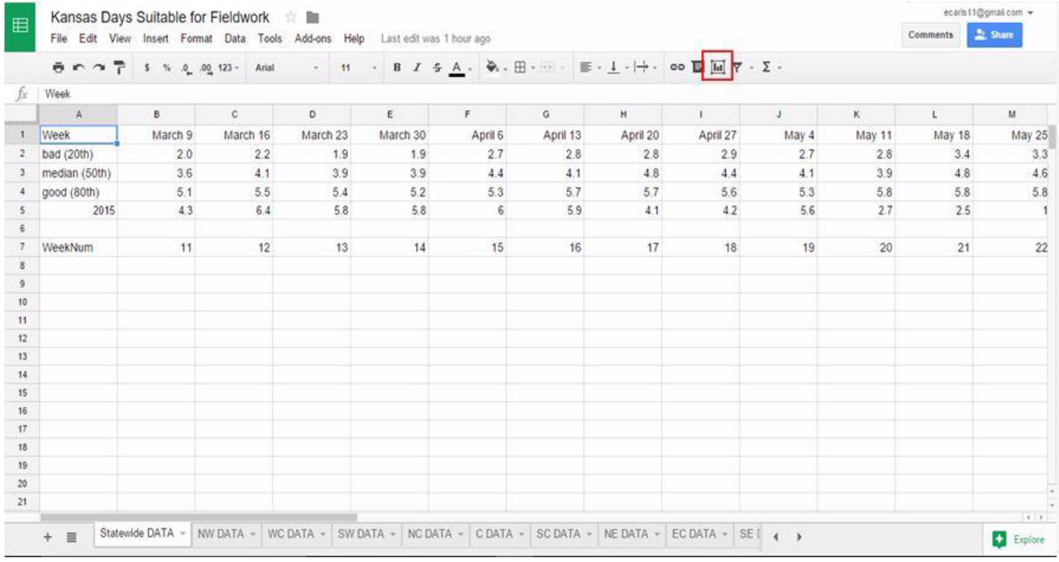
Once the spreadsheet data were properly arranged, we could create graphs using the built-in capabilities. We selected the data of interest and then began the process of creating a chart by choosing the "Insert chart" function (toolbar icon outlined in red in Figure 1).
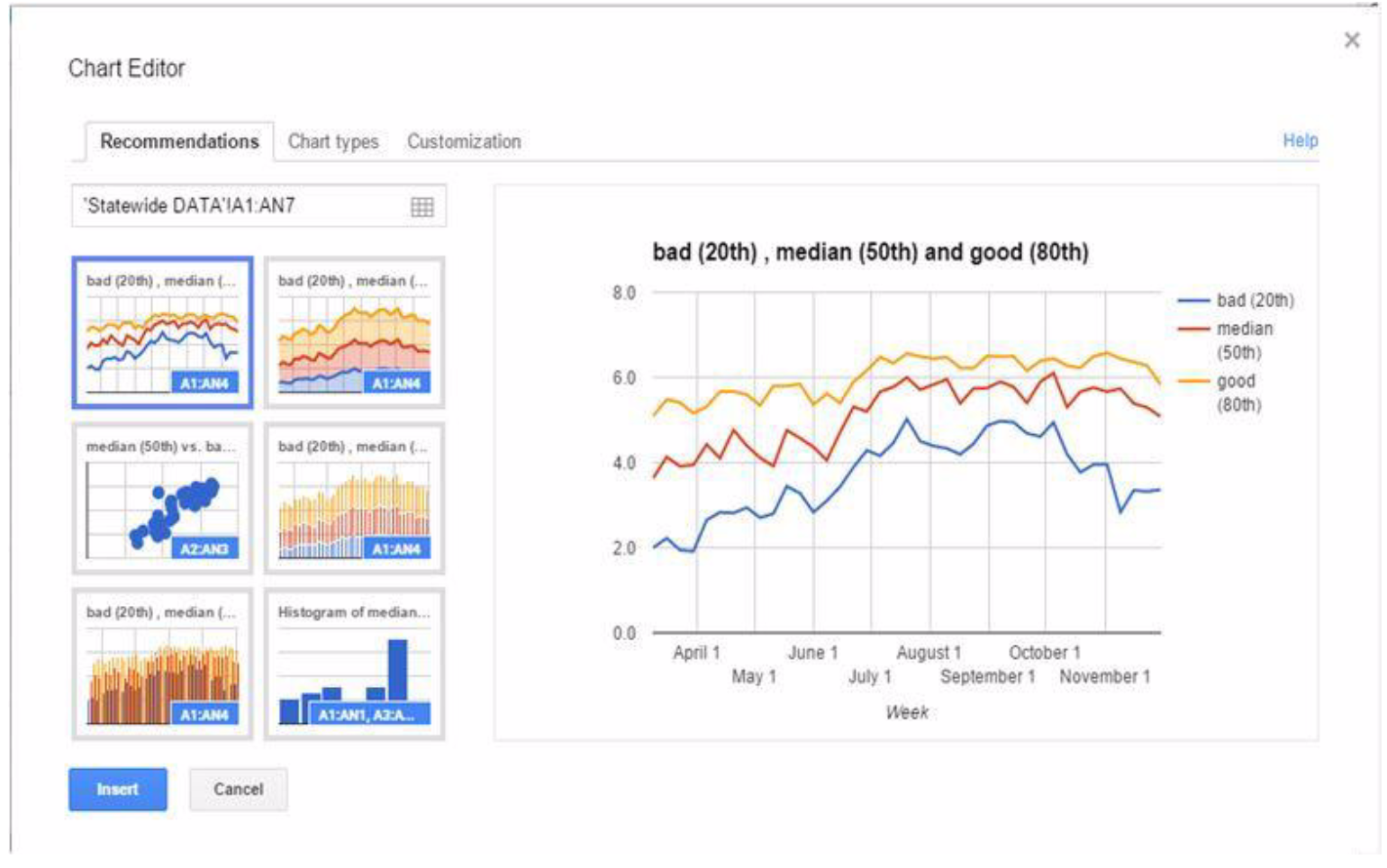
Figure 2 shows the "Chart Editor" pop-up window and available chart options. Specifically, it shows chart options for the Kansas statewide DSFW data. On the "Recommendations" tab, the user chooses the type of chart desired. For the DSFW data, we chose the chart recommendation indicated, but the user may select from a variety of chart types on the basis of individual needs and how particular data should be displayed. To perform additional formatting of the chart, the user selects the "Customization" tab. On the "Customization" tab, the user can choose a title, add labels to the horizontal and vertical axes, modify the legend, and use other formatting tools.
Figure 2.
Screen Capture of Google Sheet Chart Editor Used to Make a Graph
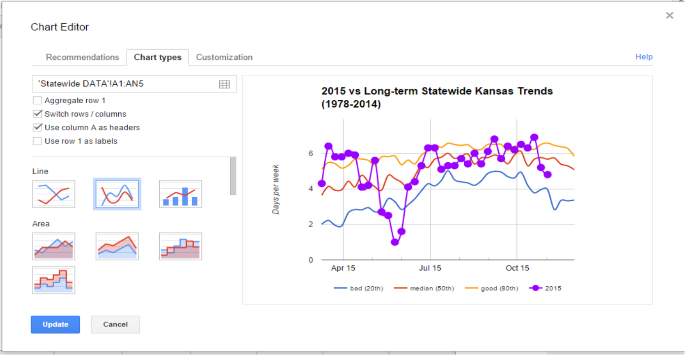
To format the graphs for the DSFW example, we deselected the "Use row 1 as labels" option and selected the "Smooth line chart" option on the "Chart types" tab (Figure 3). We also added a chart title and axes labels and changed the location of the legend.
Figure 3.
Screen Capture Showing Options for Formatting a Graph in the Chart Editor
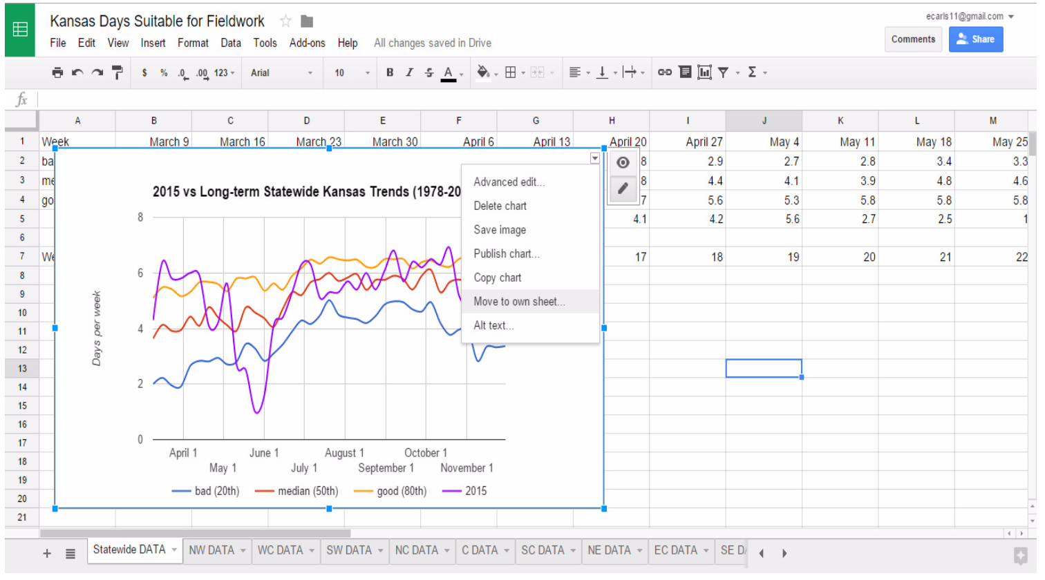
Once a graph is formatted as desired, the user inserts the graph by selecting "Insert" at the bottom of the "Chart Editor" window. Initially, the chart is automatically placed in the same spreadsheet tab as the data used to create the chart. The chart must be moved to its own tab to be properly linked with a website. To do this, the user clicks the small arrow in the top right corner of the chart and then selects "Move to own sheet" (Figure 4).
Figure 4.
Screen Capture Depicting Action of Moving a Chart to Its Own Spreadsheet Tab
At this point, the graph can be visually assessed for aesthetics and the need for changes. Two methods exist for making changes. For most simple changes, the user clicks on the part of the graph that needs changing (e.g., data series, legend, title), right-clicks, selects the name of the item to be edited, and then makes the necessary changes. For more complex changes, the user clicks the small arrow in the top right corner of the chart and then selects "Advanced edit"; the chart editor "Customization" tab displays, and the user makes the necessary changes.
Once a chart is completed, it can be published. To publish a chart online, the user accesses the desired spreadsheet tab and selects the "Publish chart" button on the toolbar. In the "Publish to the web" window, the user selects "Embed" and "Interactive" (not "Image"). An example is shown in Figure 5. An HTML link is provided that must be copied so that a dynamic link between the Google Sheet chart and the website can be made. Using the method for the applicable website management, the user pastes the HTML code into the website to create a live dynamic link to the Google Sheets chart. To create additional charts and obtain the HTML code for the remaining data, we repeated the steps described here for each crop reporting district.
Figure 5.
Screen Capture Showing Window for Publishing Charts
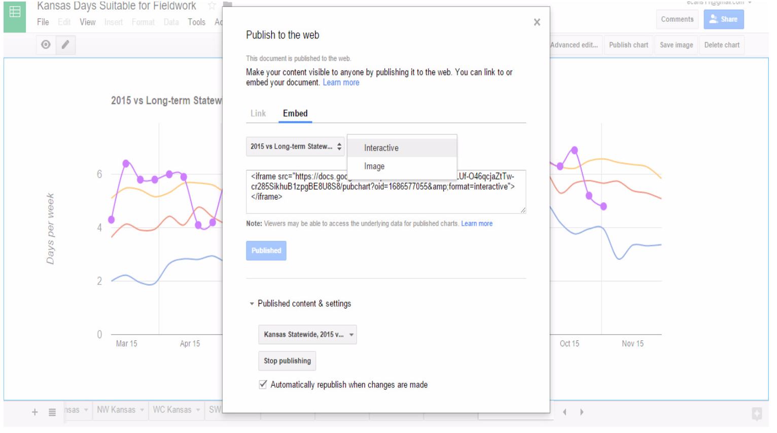
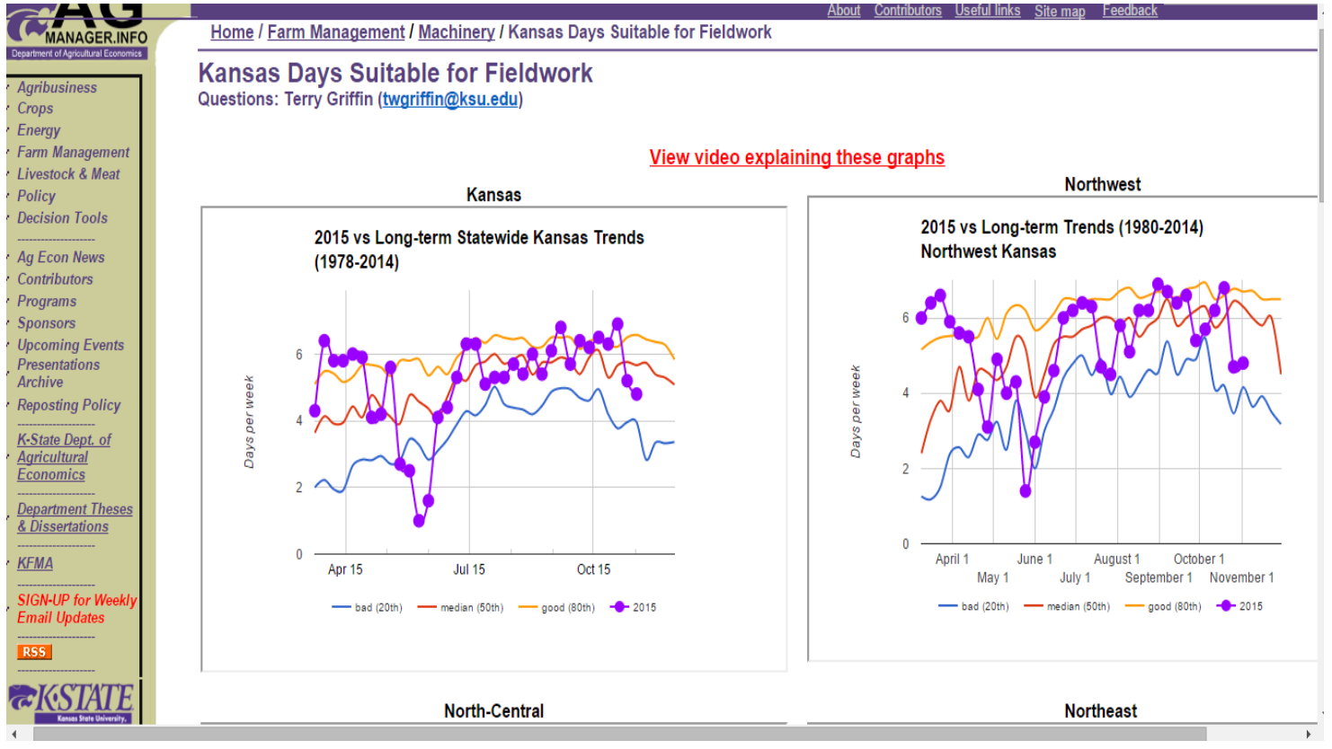
Figure 6 shows interactive charts we have created as they appear on the AgManager.info website. Once the base data were graphed and made available online, the weekly data from 2015 could be added to the data tab for each crop reporting district each week. The charts were automatically updated when the new data were entered in the Google Sheet, and the data were dynamically linked to the AgManager.info website. Someone accessing the AgManager.info website may hover the cursor over graphed data to see relevant values display.
Figure 6.
Screen Capture of AgManager.info Interactive E-Charts
Stakeholder Use
The project described here was initiated in March 2015, and activity was monitored throughout the 2015 summer crop growing season. The interactive charts averaged 693 visits each month from March through August, with a high of 817 visits in April and a low of 594 visits in July (Table 1). The page rank remained relatively constant at 30th most visited, ranging from a high of 24th in June to a low of 34th in July (Table 1). Although the page rank data are more difficult to explain given the dependence on other pages and relative importance of time-sensitive material, the number of visits each month can be explained. The rainfall across Kansas in April and May 2015 was unprecedented, and several long-standing minimum DSFW records were broken during that time. July 2015 was relatively normal, and other than the finishing of wheat harvest, very few field operations were occurring. During the 6-month monitoring of the interactive charts, over 4,000 web page visits were recorded.
| Month or metric | Visits | Page rank |
| March | 794 | 30 |
| April | 817 | 25 |
| May | 632 | 33 |
| June | 719 | 24 |
| July | 594 | 34 |
| August | 601 | 33 |
| minimum | 594 | 24 |
| maximum | 817 | 34 |
| average | 693 | 30 |
| Note. AgManager.info included 4,200 total and 700 active web pages during the 2015 growing season. | ||
Conclusion
Interactive charts are useful for engaging Extension clientele. Modern collaboration applications, such as Google Docs, allow low-cost hosting of data for online delivery in real time. In addition to creating and publishing interactive charts using Google Sheets, it is possible to create interactive maps using Tableau Public, another software product with a freemium version.
References
Buller, O. (1992). Days suitable for field work in Kansas (103). Manhattan, KS: Kansas State University Agricultural Experiment Station. Retrieved from https://krex.k-state.edu/dspace/handle/2097/16441
U.S. Department of Agriculture, National Agricultural Statistics Service. (2015). Crop progress & condition. Retrieved from www.nass.usda.gov/Statistics_by_State/Kansas/Publications/Crop_Progress_and_Condition/
Williams, J., & Llewelyn, R. (2013). Days suitable for field work in Kansas by crop reporting regions (Publication: AM-JRW-2013.1). Manhattan, KS: Kansas State University Department of Agricultural Economics. Retrieved from http://www.agmanager.info/farmmgt/machinery/FieldWorkdays_Kansas.pdf
Williamson, R. D., & Smoak, E. P. (2005). Embracing edutainment with interactive e-learning Tools. Journal of Extension, 43(5) Article 5IAW2. Available at: http://www.joe.org/joe/2005october/iw2.php