 |
April 2015
 // Volume 53 // Number 2 // Tools of the Trade // v53-2tt3
Design Clarity in Public Outreach Documents: A Guidebook for a First Detector Volunteer Network
Abstract
We established a first detectors network by inviting woodland owners to monitor for invasive pests on their property as volunteers. Accessible outreach materials are necessary to communicate volunteer responsibilities. A professional graphic design firm provided a series of design and layout techniques, including font size, font style, spacing, color palette, backgrounds, and figures, that improved our instructional guidebook. The guidebook was received positively in anonymous volunteer evaluations and in face-to-face discussion. The techniques may be useful in the development of materials for other outreach programs.
Introduction:
Effective Extension outreach requires the development of straightforward and accessible communication (Verma & Burns, 1995; Sundermeier, 2005). This becomes especially important when outreach materials are intended for volunteers, who may not have experience in the natural resource sciences or management related to their volunteer activity (Boyd, 2004; Corp, Rondon, & Van Vleet, 2013). Materials must be tailored to the needs and learning style of the volunteers: any less and what is intended to be an aid can instead become a drain on the project (Richardson, Clement, & Mustian, 1997). Working with the Minnesota Extension Service and the Minnesota Department of Agriculture, we initiated a first-detectors project to engage private woodland owners in watching for and reporting invasive woodland pests on their property. Early on, instruction booklets were created to show volunteers how to monitor for invasive species on their property and explain the scientific foundation upon which the project was based. Here we provide guidelines for designing similar booklets.
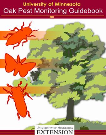
A first-detector network, begun in 2012, has woodland owners monitor for invasive oak pests on their private property. The responsibilities of these volunteers included setting up pheromone traps, making observations on any pest injury to their oak trees, and submitting weekly the pheromone trap liners and other observations to our lab. These volunteers were geographically dispersed over a significant portion of central Minnesota, and therefore it was impossible for program personnel to oversee each volunteer's weekly submission process. The information booklet addressed basic questions about the program and submission process, which did not require program personnel involvement (Figure 1).
Figure 1.
Cover of Oak Pest Monitoring Guidebook

Required activities were complex. Volunteers assembled and mounted five insect traps of two different designs (Pherocon III delta trap and 1-C wing trap). They had to place the correct pheromone in its associated trap, which required special handling techniques to prevent cross-contamination. Each week, volunteers examined three of their oak trees for evidence of injury by any of nine different insect species. Each species was associated with a characteristic injury pattern. Each week, volunteers replaced the liners in every pheromone trap (individually bagged), consolidated that week's liners, and mailed them and their oak observation report sheet to the University of Minnesota. These activities were new to our volunteers, only one of whom had been involved with any Extension volunteer program previously.
Design Guidelines:
The booklet's preliminary draft was created by an interdisciplinary team from the Departments of Entomology, Applied Economics, and Psychology at the University of Minnesota. A professional graphic design firm was hired to improve it for the volunteers. The design consultant indicated that the booklet must be revised substantially for a general public that was interested in woodlands. The consultant indicated that the use of fonts, spacing, figures, and even the name of the booklet did not reflect the preferred learning style of the end-user. Landowners exhibit active learning styles and prefer written material to be relayed straightforwardly and be immediately applicable to specific tasks (Downing, 1999).
The consultant stressed that professional academics are trained to absorb information in a manner unique to their discipline. Design conceits that are effective for accurately communicating condensed scientific information are often unfamiliar or alienating to the general public. It is often preferable to "decompress" information, even if it means significantly increasing the number of pages in a document or simplifying the content, to facilitate landowner learning styles. Specific suggestions are listed in Table 1, and examples are provided in Figures 1 (above) and 2-3.
| Category | Design Rationale | Solution |
| Name (Figure 1): |
Designers must be aware of connotations of certain words, e.g., "booklet," "handbook," "instructions". Natural resource volunteers want applicable, accessible information. |
Use "Guidebook." This is neither formal nor demanding, and is indicative of reference information for immediate use. |
| Font (Figure 2): |
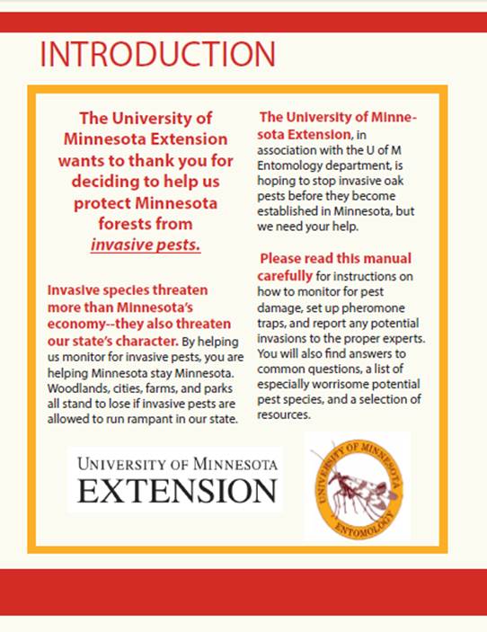
Small fonts are difficult to read. Extreme font variation appears cluttered and interferes with readability for non-academics. Sans-serif fonts (e.g., Helvetica and Arial) are more readable and scalable than serif fonts. Dark-on-light is easier to read than the opposite. |
Three or fewer font sizes per page for clarity. San-serif fonts where possible, except to match pre-existing logos. Text preferentially dark-on-light. |
|
Bolds/ Italics (Figure 2): |
Bolds and italics are often unnecessary if content has been reduced to most readable, accessible format. Bolds, blacks, and condensed can be appropriate if used as default version of typeface in document. |
Minimal use of bolds and italics. Underlines used for URLs (hyperlinks) to emphasize online options. |
| Spacing (Figures 2-3): |
"White space" directs the eye through the document (composition) and is not "wasted" space. Space can be useful for volunteers to write notes. Images and figures, when placed correctly, lead the eye through text, left-to-right. |
Paragraphs and figures formatted with substantial buffer space. Location of figures and images lead reader through content in correct sequence. |
| Color (Figure 2): |
Familiar color patterns establish trust in target population. Consistent color palettes are more organized and less confusing to readers. Color connotations (e.g., orange for warning, blue for calmness and authority) emphasize meaning. Computer screens are RBG, print is in CYMK. |
Used University of Minnesota Extension palette because it is a trusted institution for the target population. Color palette used consistently. Used a CYMK-compatible palette to ensure authenticity in print. |
| Background (Figures 1-3): |
Background graphics and motifs should be minimal or absent, as they are often extraneous/distracting. Complex backgrounds disrupt page composition, clutter documents, and may interfere with ease of reading, especially if the margins/bleeds are untidy. |
No background motifs. Borders simple, with block colors to differentiate major categories. |
| Figures and Images (Figure 3): |
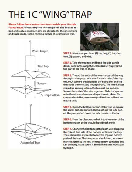
Large figures improve readability. Clear labeling denotes direct relevance to tasks. High-contrast and clearly-defined axes and keys are necessary for data relayed with graphics. Figures and images should be close to associated information; if a graphic is not directly meaningful, it should be removed from the document. Diagrams should be minimalist, with no superfluous information. |
Figures and images conspicuously labeled and included on same page as text citation. All figures and images large and not tangential to any of the other content on a page. |
Figure 2.
An Interior Page Showing Sans-Serif Fonts

Figure 3.
Interior Page Indicating How Trap Liners Are Assembled

Discussion
The guidebook for our volunteers was significantly revised to follow the recommendations of the design firm, and this improved its applicability for active learners. The guidebook increased in length by eight pages, but improved in clarity and accessibility for the volunteers of the program. At the end of the season, volunteers were sent a survey about their experiences. On a 1-7 scale, with 7 as the maximum, the average rating for understanding the purpose of the project was 6.4 (±1.0), with a range from 3-7 (n=22). The average rating for understanding the volunteer responsibilities was 6.5 (±.9), with a range from 3-7. These ratings were echoed during face-to-face interactions with the volunteers, many of whom praised the guidebook in particular. Outreach materials for the program were improved by respecting the respective learning preferences of academics and the general public.
References
Boyd, B. (2004). Extension agents as administrators of volunteers: Competencies needed for the future. Journal of Extension [On-line], Article 2FEA4. Available at: http://www.joe.org/joe/2004april/a4.php
Corp, M. K., Rondon, S. I., & Van Vleet, S. M. (2013). Insect identification educational volunteers created in train-the-trainer workshops in Oregon and Washington. Journal of Extension [On-line], Vol. 51(3) Article 3TOT8. Available at: http://www.joe.org/joe/2013june/tt8.php
Downing, A. K., & Finley, J. C.. (1999). Private forest landowners: What they want in an educational program. Diss. Pennsylvania State University.
Richardson, J., Clement, D., & Mustian, R. (1997). Reaching traditional and nontraditional Extension audiences. Journal of Applied Communications. Vol. 81, No. 3.
Sundermeier, A. (2005). Exotic pest invasion—Plan of action for Extension educators. Journal of Extension [On-line], Vol. 43(5) Article 5TOT5. Available at: http://www.joe.org/joe/2005october/tt5.php
Verma, S., & Burns, A. C. (1995). Marketing Extension in Louisiana: Image and opportunity. Journal of Extension [On-line], 31(6) Available at: http://www.joe.org/joe/1995december/rb1.php


