 |
October 2009
 // Volume 47 // Number 5 // Tools of the Trade // v47-5tt6
Using Bubble Plots to Aid in Extension Program Planning
Abstract
Mailing lists are an excellent method for
sending information to clientele about research, field days, or
upcoming educational events. The objective of the project described
here was to determine if bubble plot mapping could be used to analyze
a mailing list to maximize the impact of future educational programs.
Latitude, longitude, city, and the number of clientele in each city
were used to create a bubble plot with overlays of Arkansas
boundaries. The bubble plot overlay provides an easy way to interpret
the mailing list, which aids in selecting locations to plan future
events in areas where clientele impact will be greatest.
Introduction
One vital component to every good Extension program is to have an up-to-date mailing list of clientele (Torell, Bruce, & Kvasnicka, 1999). Mailing lists are a great way to send information to clientele about research, field days, or upcoming educational events. When new programs are developed/enhanced or new specialists are hired, there may be a need to develop a mailing list. Existing Extension lists (producers, agents, and specialists), the yellow pages, directories of stakeholder groups such as associations/organizations, registrations, city and state records, and colleagues are all sources important in the development of a mailing list (Israel, 1993). If available, the list should include more than the contact information, such as helpful information about gender, business type, crop, specific interests, etc., which will allow the list to be sorted to help identify useful subgroups in the mailing list.
In addition to developing the list, it is important to properly interpret the list. It would be particularly helpful to know where the majority of the clientele are located so that programs could be created and offered in those locations. The objective of the project described here was to determine if statistical software and bubble plot graphing could be used to analyze a mailing list to better plan and maximize the impact of future turfgrass educational programs in Arkansas.
Method
Step 1. List. Create a mailing list database for your clientele. As an option in this database additional information such as gender, business type, crop, specific interests, etc., can be included.
Step 2. Import. Copy or import database information into JMP® 7.0 (SAS Institute Inc., Cary, NC) or an updated version of JMP®.
Step 3. Distribution. Using JMP® or another statistical software package, determine the distribution (count or number) of your clientele for each city. NOTE: This is an opportunity to combine mistyped or multiple typings of a city/town (e.g., Ft. Smith, Ft Smith, Fort Smith) to get the correct distribution.
Step 4. Location. Merge latitude and longitude data from an external database for each city with the data gathered in the previous step. NOTE: This data is usually available from GIS/GPS specialists or from helpful Web sites such as <http://geonames.usgs.gov/pls/gnispublic/>.
Step 5. Bubble plot. Bubble plots can be created in JMP with up to six dimensions; X, Y, size, ID, color, and time. Create a bubble plot using JMP® with latitude was the Y component, longitude the X component, city/town as the identification, number (count) of clientele per city/town as the size and color component. The time component was omitted in the experiment reported here. Bubble size can be adjusted with a sliding size selector to allow for better interpretation.
Step 6. Mapping. Create a city, state, region, or country map. In this example, a JMP® script was already available for Arkansas. A digital image of the state, region, or country will also suffice if none is available.
Step 7. Overlay. Overlay the images created from steps 5 and 6. This may require some resizing in order for the images to properly align. This can be done in JMP® by copying the image from step 6 and pasting onto the bubble plot. Additionally, JMP scripts can be modified by expert programmers to include a map as part of step 5. Other image editing programs such as Adobe® Photoshop® can also be used to resize and overlay images created from steps 5 and 6.
Step 8. Interpret. Visually assess the total clientele distribution and by subgroups in order to determine locations with critical needs. Cities with overlapping bubbles indicate a critical need.
Findings and Discussion
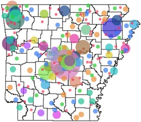
The distribution of the mailing list (n=1350) indicated that there were many cities with multiple clientele (Table 1). Further analysis of this distribution with bubble plot mapping overlayed with Arkansas state and county boundaries provided a graphical interpretation of where these cities were located and the size of the clientele base (Figure 1). Bubble color and size indicated the number of clientele on the mailing list from a particular city/town. Large or overlapping bubbles indicated areas where clientele population is high and where program impact could also be high because bubble size is based on clientele size.
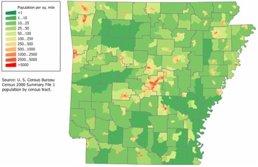
The bubble plot overlay (Figure 1) identified three critical areas where clientele impact would be greatest: Northeast, Northwest, and Central Arkansas. When the entire mailing list analysis (Figure 1) was compared with a population distribution map of Arkansas (Figure 2), it was apparent that the majority of turfgrass clientele were located in areas with high population densities. This is not completely unexpected because it is known that turfgrasses are most commonly used in urban landscapes (Milesi et al., 2005) and that turfgrass professionals work in these areas.
| City | Count |
| Little Rock | 101 |
| Fayetteville | 47 |
| Jonesboro | 44 |
| North Little Rock | 32 |
| Fort Smith | 30 |
| Conway | 27 |
| Springdale | 26 |
| Hot Springs | 22 |
| Searcy | 22 |
| Sherwood | 16 |
| Bella Vista | 15 |
| Cabot | 15 |
| Maumelle | 15 |
| Rogers | 15 |
| Perryville | 14 |
| Benton | 13 |
| Paragould | 13 |
| Bentonville | 12 |
| Hot Springs Village | 12 |
| Mountain Home | 12 |
| Pine Bluff | 12 |
| Russellville | 11 |
| Arkadelphia | 10 |
| Texarkana | 10 |
Figure 1.
Bubble Plot Overlay of Arkansas Turfgrass Clientele
Figure 2.
Population Map for Arkansas
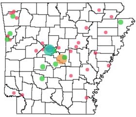
Although the turfgrass industry as a whole is associated with urban areas, not all subsets of the turfgrass industry are located in urban areas. Distribution of current or retired turfgrass (sod) producers in Arkansas (n=67, subset of dataset) indicated that the majority of turfgrass producers are in central Arkansas or are located in rural areas in close proximity to central Arkansas or another population center (Figure 3). For example, the largest group of sod producers in Arkansas are located northwest of Little Rock (Pulaski county, central Arkansas) in rural areas in Perry county.
| Level | Count |
| Perryville | 10 |
| Little Rock | 8 |
| Perry | 4 |
| Arkadelphia | 2 |
| Benton | 2 |
| Bigelow | 2 |
| Fayetteville | 2 |
| Fort Smith | 2 |
| Hot Springs | 2 |
| Manila | 2 |
| North Little Rock | 2 |
| Rudy | 2 |
Figure 3.
Bubble Plot Overlay of Sod Producers in Arkansas
This article is not the first attempt to graphically analyze a mailing list. Bazik and Feltes (1999) proposed using zip code in combination with GIS software to visualize the physical distribution or demographic characteristics of certain populations. Regardless of the exact method used, it is important to attempt to better analyze and understand the location of clientele so that programs can be developed in critical areas.
Conclusion
The bubble plot map overlay allowed for rapid, easy interpretation of the geographic areas with the greatest number of clientele. Bubble plots provide a graphical way to interpret the data from a mailing list, which aids in selecting locations for site visits or sites for educational events specifically in areas where high clientele populations exist and where impact will be greatest.
Acknowledgements
I thank Vinod Shivrain, research assistant in the Crop, Soil, and Environmental Sciences department at the University of Arkansas, for providing a JMP script that mapped the Arkansas county and state boundaries. Additionally, I thank Malcolm Williamson from the Center for Advanced Spatial Technologies (CAST) at the University of Arkansas for providing a detailed list of latitude and longitude data for Arkansas cities and towns.
References
Bazik, M., & Feltes, D. (1999). Defining your customer profile—An essential tool. Journal of Extension [On-line], 37(6) Article 6FEA4. Available at: http://www.joe.org/joe/1999december/a4.php
Israel, G. D. (1993). Program/audience identification for county extension program planning. University of Florida, Florida Cooperative Extension Service Fact Sheet PEOD-13.
Milesi, C., Running, S. W., Elvidge, C. D., Dietz, J. B., Tuttle, B. T., & Nemani, R. R. (2005). Mapping and modeling the biogeochemical cycling of turf grasses in the United States. Environmental Management 36(3):426-438.
Torell, R., Bruce, B, & Kvasnicka, B (1999). Promoting and organizing agricultural extension meetings. Journal of Extension [On-line], 37(1) Article 1TOT1. Available at: http://www.joe.org/joe/1999february/tt1.php


