 |
October 2009
 // Volume 47 // Number 5 // Ideas at Work // v47-5iw3
Visualizing and Querying Community Survey Data with Google Maps®
Abstract
This article describes how an online survey was enhanced using Google
Maps® to visualize public concerns regarding a community's water/sewer
quality while revealing patterns that could indicate a potential
source of the identified problems. Online surveys have become part of
the standard toolkit for many County Extension Offices; however,
these tools are limited when it comes to surveys involving geospatial
information. Through a few simple steps when developing the survey,
collected data can be converted for use in a GIS or online geospatial
viewer.
Introduction
As Barbara O'Neil wrote in a 2004 Journal of Extension article, as technology advances and more populations are served with easy access to the Internet, online surveys are an inexpensive and efficient technique for Extension faculty and educators to use to conduct applied research "right from their offices." While some of the limitations of using online surveys identified in Evan's and Mathur's 2005 comprehensive review of "The Value of Online Surveys" in Internet Research still exist, many of these issues have been minimized with better security, improved instruction formatting, increased access to the Internet, and new Web development techniques such as AJAX (technology used to create interactive Web applications) have made the survey process a more pleasant experience.
Today's Internet survey-building tools have also made it very easy to create and distribute surveys to citizens regarding local community issues. However, as easy as these tools are to use for building and distributing a survey, analysis of the data can sometimes be a daunting task. This is especially true when questions within the survey are of a geographic nature. For instance, when asking a participant about an environmental condition near his or her residence, it would be desirable to know the geospatial location of the residence in relation to responses from other survey participants to identify any trend in the phenomena. While it is possible to employ expensive GIS and other mapping tools to facilitate this analysis, it is also possible to provide data visualization and analysis using low cost, readily available solutions.
Background
During the summer of 2007, the City of Jefferson, Iowa, utilized Survey Monkey® to gather data in preparation for their Capital Improvement Plan. It created a water and sewer survey consisting of 22 questions, including these examples:
- Satisfaction with the water pressure
- Smell or taste of water for drinking
- Occurrence of chlorine smell or bitter taste
- Presence and use of various water filters
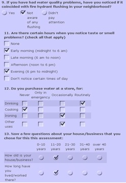
The majority of questions were multiple-choice with single or multiple answers, rating scales, or matrix questions allowing multiple answers as shown in figure 1. Demographic and address questions were also included in the survey, with the latter asking for the city block of the residence or business that the survey was sampling.
An implied hypothesis was that, if any perceived problems or conditions existed in the city, by utilizing the block address, capital improvement projects could be pinpointed.
Figure 1.
Question formats : 9) Multiple-choice single answer, 11) Multiple-choice multiple answer 12) Multiple-choice matrix and 13) Single-choice matrix
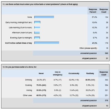
At the time the survey was developed, the expectation was that the results would be presented using summary graphs and tables as shown in figure 2. However, this information only gave an indication that some citizens have issues with aspects of the water/sewer quality. The summary did not identify whether or not the problems were widespread or limited to a specific neighborhood in the community, something the city council was interested in knowing. The results also did not indicate if there was a relationship between ratings for the various questions. Analysis of spatial data proved to be challenging for City Officials.
Figure 2.
Bar Graph and Matrix Table Summary Results
A resolution to this problem was to map the data in a Geographic Information System (GIS) that would allow both visual display of the data and query building to identify relationships. Unfortunately, the City board members did not have the hardware/software or knowledge necessary to develop and use a GIS. The solution was to create a Web Mashup, a Web application formed using data from several sources and various technologies resulting to an integrated tool set, using Google Maps® and a Web database.
Methods
The first step in creating the Web map was to download the results from the survey provider and transform the format of the data in Microsoft Excel®. This step was required because of the way the survey recorded the data. For example, multiple-choice questions were saved in a series of columns instead of just a single column, as illustrated in Figure 3, and required that the cells be merged together into a single column.
Figure 3.
Survey Results Transformed to a Single Column
The next step was to load the data into an online database, which was done using a MySQL® database. Once the data was loaded to the Web server, data fields for the latitude (lat) and longitude (long) were created. Using a process called "geocoding," the address for each respondent was read from the database and processed using Google's free geocoding service to produce lat/long for each record.
After the database contained all of the necessary information, a Google Maps® was created and configured to import all of the lat/long points from the database and display them over the map. A query form was added to the Web page to allow the viewer to select the criteria of the points displayed on the map. This last step requires access to a server (which can be hosted externally) and a little knowledge of AJAX, or at least the involvement of an information technology person who can support this type of programming.
Results
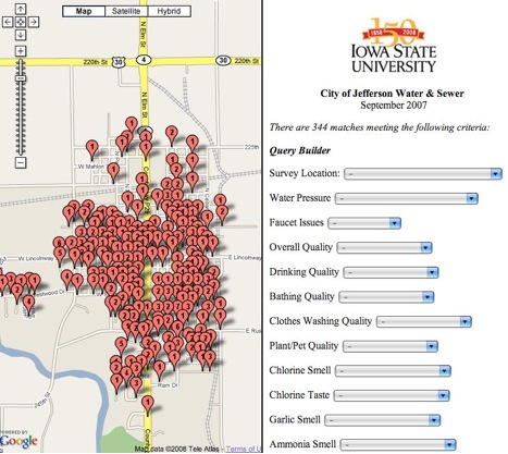
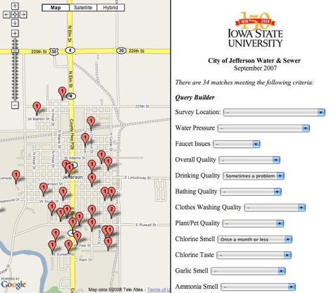
The developed interface, as shown in Figures 4 and 5, allowed the City Council to see all of the locations of the respondents and make multiple queries to investigate if there was a relationship between water/sewer characteristics and geographic location. Because the maps were accessible online, the council was able to present the information interactively during the City meetings, thus energizing the discussion of the survey results.
Figure 4.
Location of All Survey Respondents. Numbers Represent Number of Respondents Within a City Block.
Figure 5.
Block Location of Results Meeting the Selected Query Criteria
Recommendations
The symbols used to identify the location of query matches contain a number representing the number of matches on that particular city block. This was done to make the map easier to read, to provide anonymity and to maintain a quantified visual representation. To facilitate this in future projects, the survey form should include the building/ house number as a separate field so that the geocoding process can convert the value to an address that ends in 50, thus representing the center of the block.
Conclusions
The use of Google Maps® allowed for easy sharing of the data and informative discussion of the results without requiring the end users to have more than basic Internet browsing skills. The ability to dynamically select only the surveys meeting a specific set of criteria and then display the data directly on the map brought the survey results to life and enriched the meaning of the data, significantly adding to the decision makers understanding of the collected information.
References
Evans, J. R., & Mathur, A. (2005). The value of online surveys. Internet Research, 15(2), 195-219.
O'Neill, B. (2004). Collecting research data online: Implications for Extension professionals. Journal of Extension [On-line], 42(3) Article 3TOT1. Available at: http://www.joe.org/joe/2004june/tt1.php


