Summer 1992 // Volume 30 // Number 2 // Feature Articles // 2FEA5
To Be Seen and Heard By All
Abstract
Extension clients of all ages have visual and hearing impairment that limit their ability to participate in Extension programs. Clients who have visual impairments can be helped when Extension produces publications based on the elements of contrast and identification. Hearing impaired clients can better learn from presentations when background noise is controlled, they're seated near the presenter, and the presenter uses high quality visual aids.
Millions of Americans of all ages have less than perfect vision, less than perfect hearing. Yet every day, these same Americans are clients of Extension. They read fact sheets, newsletters, and a variety of Extension publications. They attend meetings and programs in county offices, people's homes, and metal pole buildings at fairgrounds on the edge of town.
Who are these Extension clients with visual and hearing impairments? They can be anyone. Visual and hearing impairments don't affect only older people. After the age of 30, everyone's sight begins to decline. By age 65, almost everyone will have less ability to focus, resolve images, discern colors, and adapt to light.1 After age 50, we all begin to lose some of our hearing ability every year. By age 60 or 70, as many as 25% of older Americans are noticeably hearing impaired.2
We've worked to make our buildings accessible to people with obvious physical challenges, but have we made a conscious effort to offer programs and publications that are easy for visually and hearing impaired clients to understand? Extension workers can compensate for their clients' lack of perfect vision or hearing by paying attention to the publications they produce, the locations, and the presentation styles and graphic designs they use.
Publication Clues
Contrast is the ability to focus on what's seen. The greater the color contrast between the type and paper, the easier it is to see it clearly. A color is identified by the amount and frequency of light reflected back to the eye. The color white is the most reflective, and black is the least. Contrast, as shown in Figure 1, is greatest between black and white because they're located at opposite ends of the light spectrum.
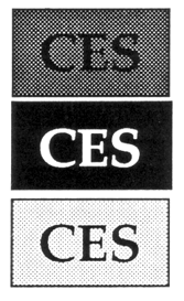
Figure 1. Greatest contrast between black and white.
Problems with contrast arise when using both colored paper and ink. Different shades of the same color, such as red on pink or black on gray, reduces the readability of publications for older or visually impaired readers. Physical changes in the eye cause elderly people to see the world as if they were looking through a yellowish film. If you plan to use colors, place a yellow filter, such as a yellowed overhead projection film, over the page to see how the paper may look to older clients.
With age, the ability to distinguish among greens, blues, and purples is reduced. When creating bar charts and graphs choose reds, oranges, and yellows rather than blues and greens. Also consider using dots or cross-hatches to increase clarity, and select colors from different ends of the color spectrum.
An image is more readable when the edges of the image remain crisp. Metallic ink, shiny paper, enlargements, and brilliant colors enhance publications, slides, and filmstrips. But, too much of a good thing makes blurry and tiring images for older eyes.
Identification is the ability to recognize specific images. In printing, the size and detail of the image depends on the choice of font and spacing. Choose a font that's large enough to be seen clearly, and simple enough that the smallest letters are crisp and clear. Fancy or decorative type styles are nice for emphasis, but difficult to read when used for text (see Figure 2).
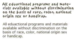
Figure 2. Decorative type is difficult to read.
The white space within and surrounding a letter or image is equally important. More internal white space increases legibility. Always use proportional spacing, where the white space between letters is kept constant regardless of letter width. Serif type best meets these requirements. The spacing between lines of type also increases readability. When paper space is a concern, smaller type and an additional point of leading and vice versa can be used to save paper space and yet maintain readability.
The design of the page is also important. Use standardized indentations and capitalizations to provide visual cues. Only use all capital letters in short titles or to label a visual. The use of all capital letters gives readers the feeling of being shouted at. Smaller blocks of copy, horizontal and vertical divisions, and shorter lines of five to six inches increase readability. Columns afford maximum use of white space. Margins, with the exception of the interior margins of bound publications which are often in a shadow, don't have to be more than one-quarter of an inch. Straight left-hand margins are helpful, but right justification has little impact on the visual effectiveness of a page.
Lastly, consider how the publication handles. Are pages easy to turn? Is the paper slick or does it have texture and a high "feel factor"? Do the pages stay turned or does the booklet flip closed?
To help clients compensate for decreased abilities to focus and recognize images, it's important to apply these publication clues to any teaching tool that involves seeing. When planning posters, slides, and overheads for a presentation, the same principles of contrast and identification apply.
Presentation Clues
The success of an audiovisual presentation depends on the ability to hear as well as to see it. Aside from turning up the volume, there are variables a presenter can control to be more easily heard and understood.
When presenting a program, control background noise. More than anything else, these competing sounds interfere with hearing for people with and without hearing aids. Unfortunately, Extension workers often give presentations in locations that challenge the laws of acoustics. It's most difficult to control background noises outdoors. Invite those who might have trouble hearing to stand or sit closer to the speaker. Whether they realize it or not, hearing impaired people use many visual cues, and unknowingly may read lips to compensate for their hearing loss. When working in someone's living room, the most important distraction may be background noise. Ask to turn off the radio in the kitchen, and quiet children when the presentation begins.
When presenting in a large hall, arrange chairs in slightly curved rows so the speaker can be seen from every position. Set up only as many chairs as needed so the audience will sit in a group towards the front of the room rather than spread out. Lay pieces of carpeting around the audience area to absorb the sound. Check all electronic equipment before using. Speak slowly, clearly, and directly to the audience. Rephrase important points as they are made. When people from the audience ask questions or make comments, repeat them so everyone in the audience can hear and then participate in the discussion.
Use visuals to emphasize important points or to help deliver your message. Label graphs, schematic drawings, and other visual aids to ensure understanding. Use clean, as large as possible, and perhaps bold-faced type against a contrasting background. Choose or create slides with as much light in them as possible. Dark backgrounds make the image on the screen more difficult to see, and further darken the presentation room. When turning on the lights following a film or at the conclusion of a slide set, give the audience time to make the transition from darkness to light. After brightening the room, be sure to provide the audience with ample audio clues as they readjust their vision.
Conclusion
Extension clients of all ages have visual and hearing impairments that limit their ability to participate in Extension programs. Clients who have visual impairments can be helped when Extension produces publications based on the elements of contrast and identification. Hearing impaired clients can better learn from presentations when background noise is controlled, they're seated near the presenter, and the presenter uses high quality visual aids. It's our responsibility as the producers of Extension materials to design publications and presentations that meet the special visual and hearing needs of all our clients.
Footnotes
1. Truth About Aging: Guidelines for Accurate Communications, AARP, 1909 K Street, Washington, D.C. 20049.
2. Geriatric Care: Hearing Problems in the Aging, XVI (November 1984), 1-2.