December 2020
|
December 2020 // Volume 58 // Number 6 // Ideas at Work // v58-6iw3


Using Data Visualization to Demonstrate Outcomes—Examples From Ripple Effects Mapping
Abstract
If you have conducted a ripple effects mapping (REM) event, you may have wondered "What is the best way to use these data, and what are some creative options for sharing the findings?" REM involves a mind mapping approach to evaluation and is an effective way to collect qualitative data that document the direct and indirect impacts of complex programs and projects. We provide examples of visual ways to display the gathered data and describe how to use the information to elevate your program outcomes.
Introduction
Qualitative data, often collected through focus group sessions or interviews, are usually shared in transcribed words only. However, the rich and visual qualitative data generated by ripple effects mapping (REM) can be used in multiple ways to leverage information collected through the experiential process. Facilitators of an REM process lead participants through a data collection exercise combining elements of appreciative inquiry, storytelling, and mind mapping (Hansen et al., 2018). The process of visualization of participant stories and experiences results in the collection of unique qualitative and quantitative data that illuminate the impacts and effects of collaborative projects and programs. The products generated through REM can be used as tools to aid in program evaluation and communication. Herein we provide examples of REM data visualization for communication purposes.
Background
Each author has been a designer, practitioner, trainer, and/or program lead for REM and has experienced the "what to do with the data" dilemma from all aspects. As Extension professionals, we are interested in sharing ways in which we have used the process, not just as a data collection and evaluation method but also as a way to generate powerful visual storytelling tools. We do not walk you through the how of conducting an REM event. Refer to Field Guide to Ripple Effects Mapping (Chazdon, Emery, et al., 2017) or Advanced Facilitator Guide for In-Depth Ripple Effects Mapping (Hansen et al., 2018) for information about the core components, methods, and steps for conducting an REM event.
Storytelling and Visualization
As Extension professionals, we are regularly challenged with capturing the value and impact of our work in compelling ways—work that needs to be shared with our funders, the communities we serve, and the universities at which we work. Storytelling is a powerful technique that can be used in many different ways to communicate Extension work (Edwards et al., 2019; Franz, 2016.) Stories help us understand and assess the impacts and value of Extension work in a way that quantitative data cannot (Peters & Franz, 2012). Cowger and Tritz (2019) stated, "More than numbers, our participants' stories reveal their educational needs and achievements and the rich, robust, and sometimes powerfully emotional real-life impact of our program" (Applications for Extension Educators section).
Narrative visualization, the process of transforming data into visually shared stories, is increasingly being used by researchers, journalists, and the business community as an effective way to communicate complex themes and facilitate data analysis (Lee et al., 2015; Segel & Heer, 2010). Visualizations aid in our ability to process complex interactions and understand the world around us (Fox & Hendler, 2011). Like concept mapping or social network analysis, REM results in a visual representation of the connections and relationships between actors and the cause and effect of collective organization (Hansen Kollock et al., 2012; McLinden, 2013). When group structures and interactions can be clearly visualized, collaboration and group function can improve (Yoon, 2011). The stories elicited through the REM process and visualized on the emerging map become a powerful way for participants to understand and communicate the impacts of a group's work (Emery et al., 2015).
REM Visualization Examples
The way data are packaged influences audience perception and attention (Evergreen & Metzner, 2013). Effective visualizations of REM data can be leveraged for program success in a variety of ways. Graphic products resulting from REM can include
- a photo of the REM map;
- a group photo with the REM map;
- a digital version of the REM map;
- a "story map," or digital version of the REM map with photos and quotes embedded; and
- individual ripples animated in PowerPoint presentations.
The graphic products can be used in grant reports, printed in newsletters or brochures, or printed with a large format printer and mounted for display.
Photo of the REM Map
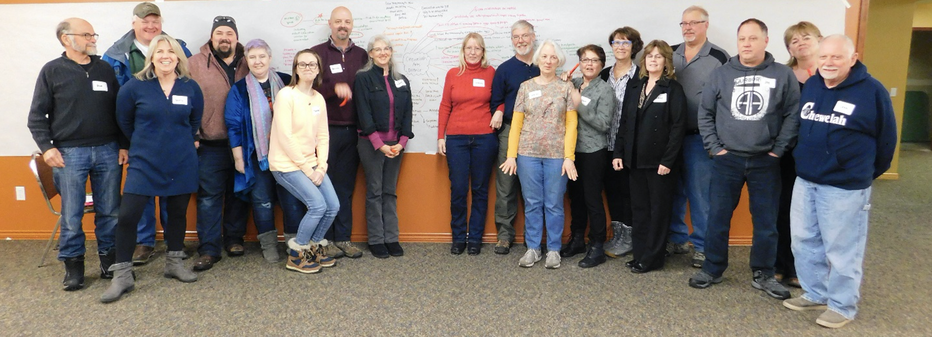
An example of a completed "raw" map from an REM event is shown in Figure 1. The image has visual power and is "a massive piece of evidence about the richness and complexity" of the group's efforts (Sibbet, 2012, p. 24). The map serves as a powerful sign of the collective work of the group, makes the relations between various events legible, and can be understood quickly and grasped as a signifier of wide-reaching impacts and interrelations, even by those unfamiliar with the work (Krämer & Ljungberg, 2016; Moriarty, 2002). The image of the map can be used in grant reports or presentations and/or printed in a newsletter or local paper as a visual demonstration of the group's impacts. Universally, we have found that after the REM process, groups have excitement and pride in being photographed in front of their expansive maps (Figure 2).
Figure 1.
Photo of Completed Ripple Effects Map
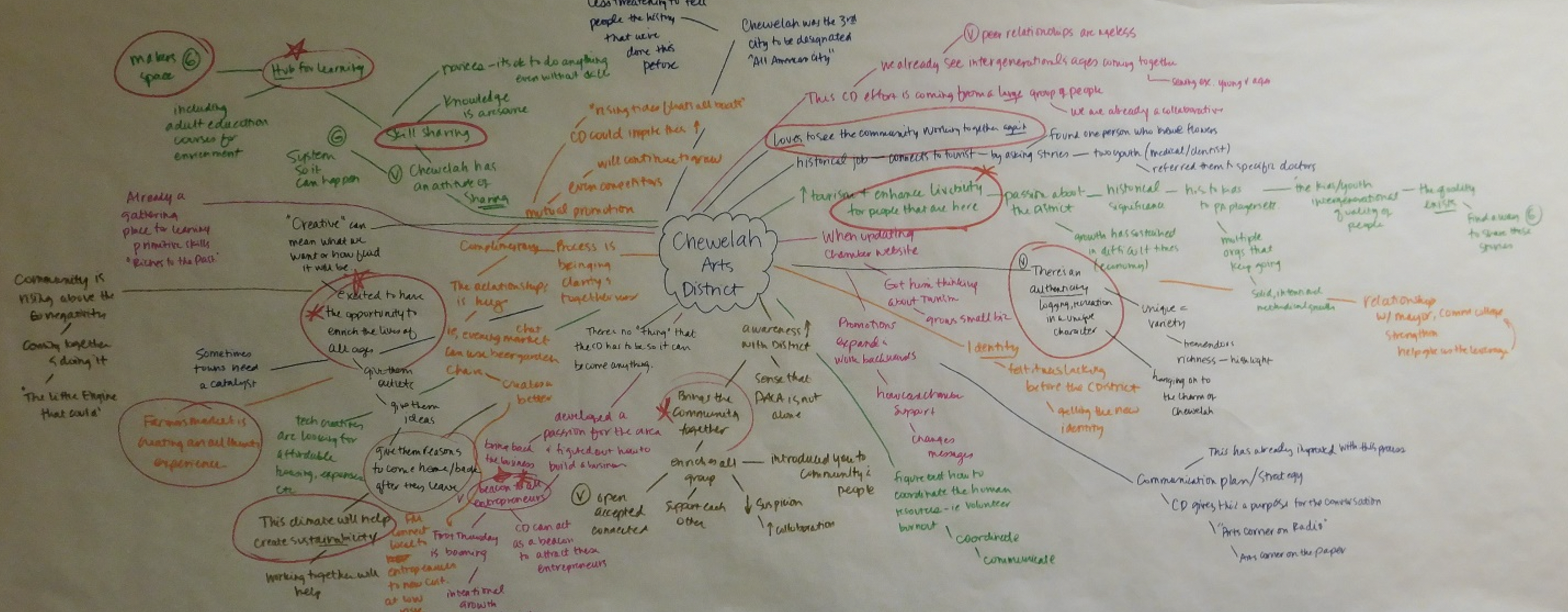
Figure 2.
Group Photo with Ripple Effects Map
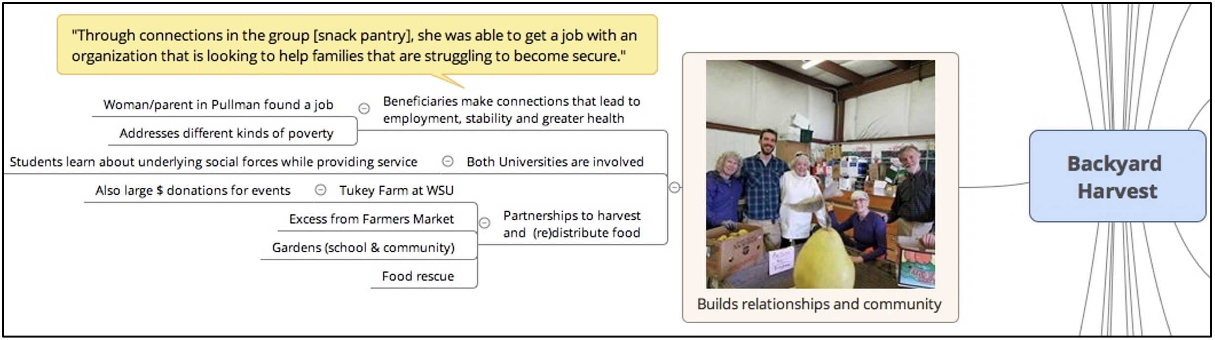
Creation of Story Maps
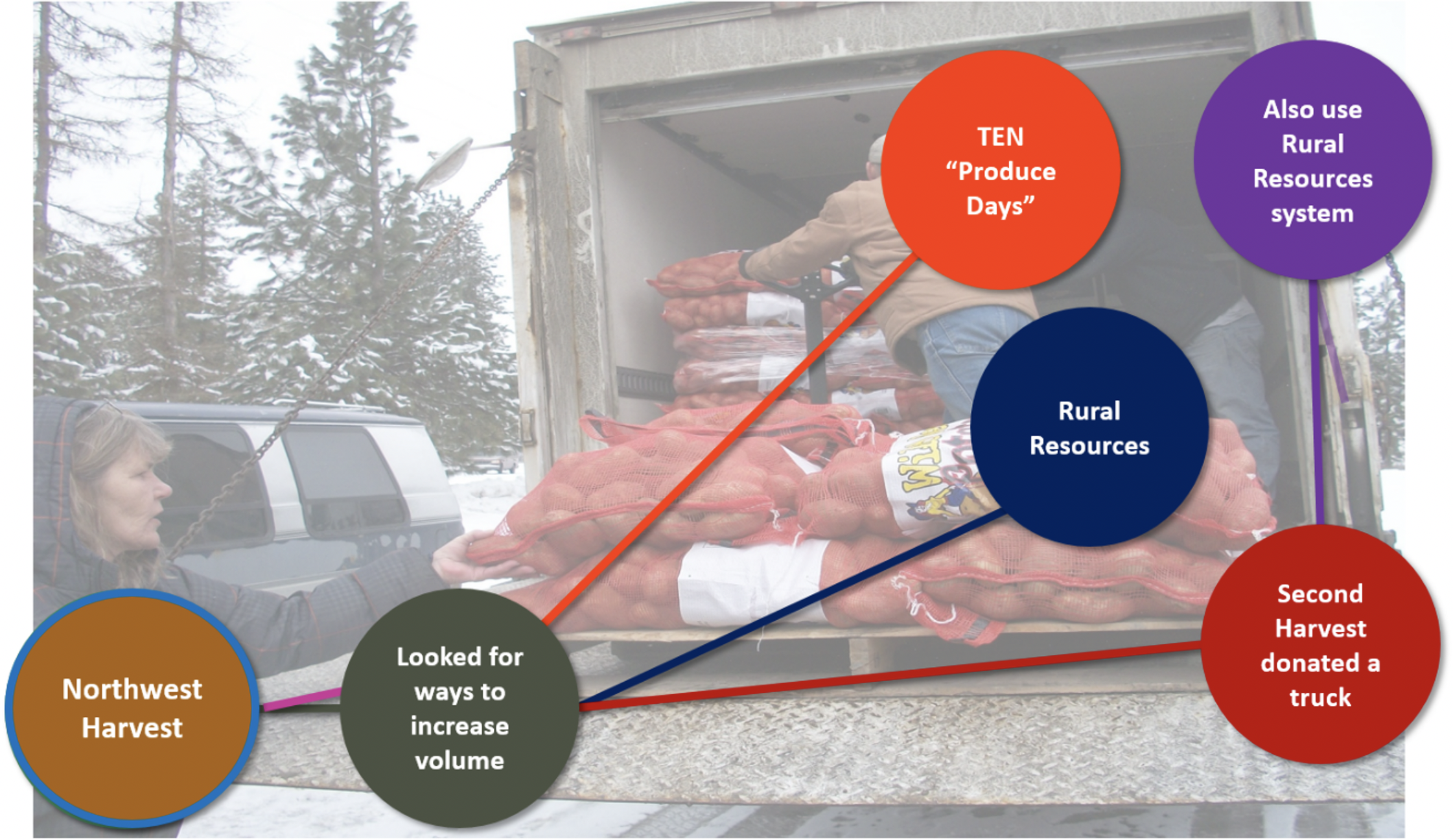
Story maps are a type of storytelling that incorporates maps, texts, photos, and graphs (Berendsen et al., 2018). A huge rise in popularity of story mapping and other data visualization techniques has occurred in recent years, with new user-friendly platforms for combining data forms emerging regularly. Story maps typically involve use of geo-referenced data on web-based platforms such as ESRI or Google Earth; however, the story map approach can be adapted to the mind maps of REM through use of free or inexpensive software such as XMind or Freemind. Transferring a raw map produced in an REM event to mind mapping software aids in coding for evaluation purposes, and the software allows for images and quotes to be embedded in the digital mind map, creating an interactive story map. These story maps can be made accessible online for user-guided interactions or used as narrative tools in presentations (Figures 3 and 4).
Figure 3.
Digital Version of Ripple Effects Mapping with Photos and Quotes Embedded
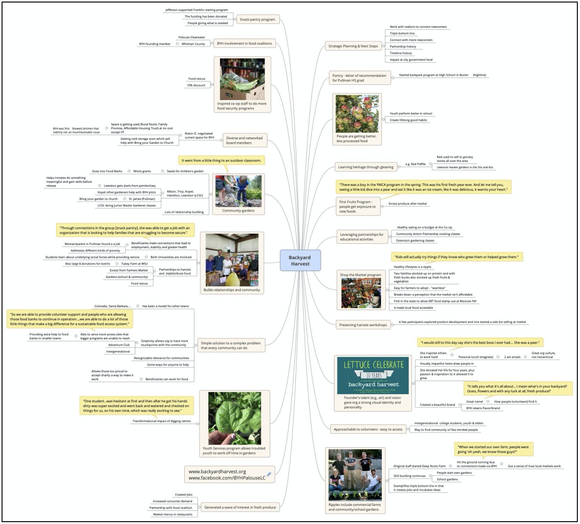
Figure 4.
Digital Version of Ripple Effects Mapping with Photos and Quotes Embedded (Enlarged to Show Detail)
Simplification of Individual Ripples
Simplification of the data also can aid in user comprehension (Evergreen & Metzner, 2013). Individual ripples can be pulled out to demonstrate specific, targeted impacts (Figure 5). These graphics can be used as stand-alone products, animated in presentations to accompany a verbal narrative, or incorporated into larger products such as Extension "public value posters" (Chazdon, Meyer, et al., 2017). Using the digitized (or original) map in public presentations gives many options for drawing new people into the project.
Figure 5.
Individual Ripples Animated in a PowerPoint Presentation
Applications for Extension Educators
As Extension educators and faculty, we are challenged to share our stories in ways others can interpret and understand. The programs and communities we work with also face the same challenges. In addition to the engaging aspect of the REM process, the visual products that result from an REM process are powerful tools that can help Extension professionals communicate impact to those that matter most: our community partners, funders, and university systems.
Author Note
Correspondence concerning this article should be addressed to Clea Rome. Email: clea.rome@wsu.edu
References
Berendsen, M., Hamerlinck, J., & Webster, G. (2018). Digital story mapping to advance educational atlas design and enable student engagement. ISPRS International Journal of Geo-Information, 7(3), 125.
Chazdon, S., Emery, M., Hansen, D., Higgins, L., & Sero, R. (2017). A field guide to ripple effects mapping. University of Minnesota Libraries Publishing. http://hdl.handle.net/11299/190639
Chazdon, S., Meyer, N., More, C., & Troschinetz, A. (2017). Public value posters: Conveying societal benefits of Extension programs through evaluation evidence. Journal of Extension, 55(4), Article v55-4tt1. https://www.joe.org/joe/2017august/tt1.php
Cowger, T., & Tritz, J. (2019). Narrative analysis research: A tool for Extension educators. Journal of Extension, 57(6), Article v57-6tt5. https://www.joe.org/joe/2019december/tt5.php
Edwards, H., Culp, K., & Jordan, J. (2019). Using an innovative multiple-methods approach to evaluate Extension conferences. Journal of Extension, 57(2), Article v57-2a1. https://www.joe.org/joe/2019april/a1.php
Emery, M., Higgins, L., Chazdon, S., & Hansen, D. (2015). Using ripple effect mapping to evaluate program impact: Choosing or combining the methods that work best for you. Journal of Extension, 53(2), Article v53-2tt1. https://www.joe.org/joe/2015april/tt1.php
Evergreen, S., & Metzner, C. (2013). Design principles for data visualization in evaluation. In T. Azzam & S. Evergreen (Eds.), Data visualization, Part 2. New directions for evaluation, Number 140 (pp. 5–20). John Wiley & Sons.
Fox, P., & Hendler, J. (2011). Changing the equation on scientific data visualization. Science, 331(6018), 705–708.
Franz, N. (2016). The Extension storyteller: Using stories to enhance meaning and catalyze change. Journal of Extension, 54(3), v54-3tt1. https://www.joe.org/joe/2016june/tt1.php
Hansen, D., Higgins, L., & Sero, R. (2018) The advanced facilitator guide for in-depth ripple effects mapping (Publication #EC008). Washington State University Extension. https://pubs.extension.wsu.edu/
Hansen Kollock, D. A., Flage, L., Chazdon, S., Paine, N., & Higgins, L. (2012). Ripple effect mapping: A "radiant" way to capture program impacts. Journal of Extension, 50(5), Article v50-5tt6. http://www.joe.org/joe/2012october/tt6.php
Krämer, S., & Ljungberg, C. (Eds.). (2016). Thinking with diagrams: The semiotic basis of human cognition (Vol. 17). Walter de Gruyter GmbH & Co KG.
Lee, B., Riche, N. H., Isenberg, P., & Carpendale, S. (2015). More than telling a story: Transforming data into visually shared stories. IEEE Computer Graphics and Applications, 35(5), 84–90.
McLinden, D. (2013). Concept maps as network data: Analysis of a concept map using the methods of social network analysis. Evaluation and Program Planning, 36(1), 40–48.
Moriarty, S. E. (2002). The symbiotics of semiotics and visual communication. Journal of Visual Literacy, 22(1), 19–28.
Peters, S., & Franz, N. K. (2012). Stories and storytelling in Extension work. Journal of Extension, 50(4), Article v50-4a1. https://www.joe.org/joe/2012august/a1.php
Segel, E., & Heer, J. (2010). Narrative visualization: Telling stories with data. IEEE Transactions on Visualization and Computer Graphics, 16(6), 1139–1148.
Sibbet, D. (2012). Visual leaders: New tools for visioning, management, and organization change. John Wiley & Sons.
Yoon, S. A. (2011). Using social network graphs as visualization tools to influence peer selection decision-making strategies to access information about complex socioscientific issues. Journal of the Learning Sciences, 20(4), 549–588.